Most restaurant reports are a spreadsheet you never open. FineDine AI Reports flips that: every scan, every view, and every order becomes one clear picture of how your restaurant is really doing — written in plain language, updated daily, and watched in real time. AI Reports is now in your FineDine dashboard.
Here's what AI Reports does, the questions it answers, and how to start using it.
1. What is FineDine AI Reports?
FineDine AI Reports is the operator's single screen for understanding everything that happens between a guest scanning a QR code and an order arriving — collected in one place, translated into plain language by FineDine AI, and shown both as history and as it happens.
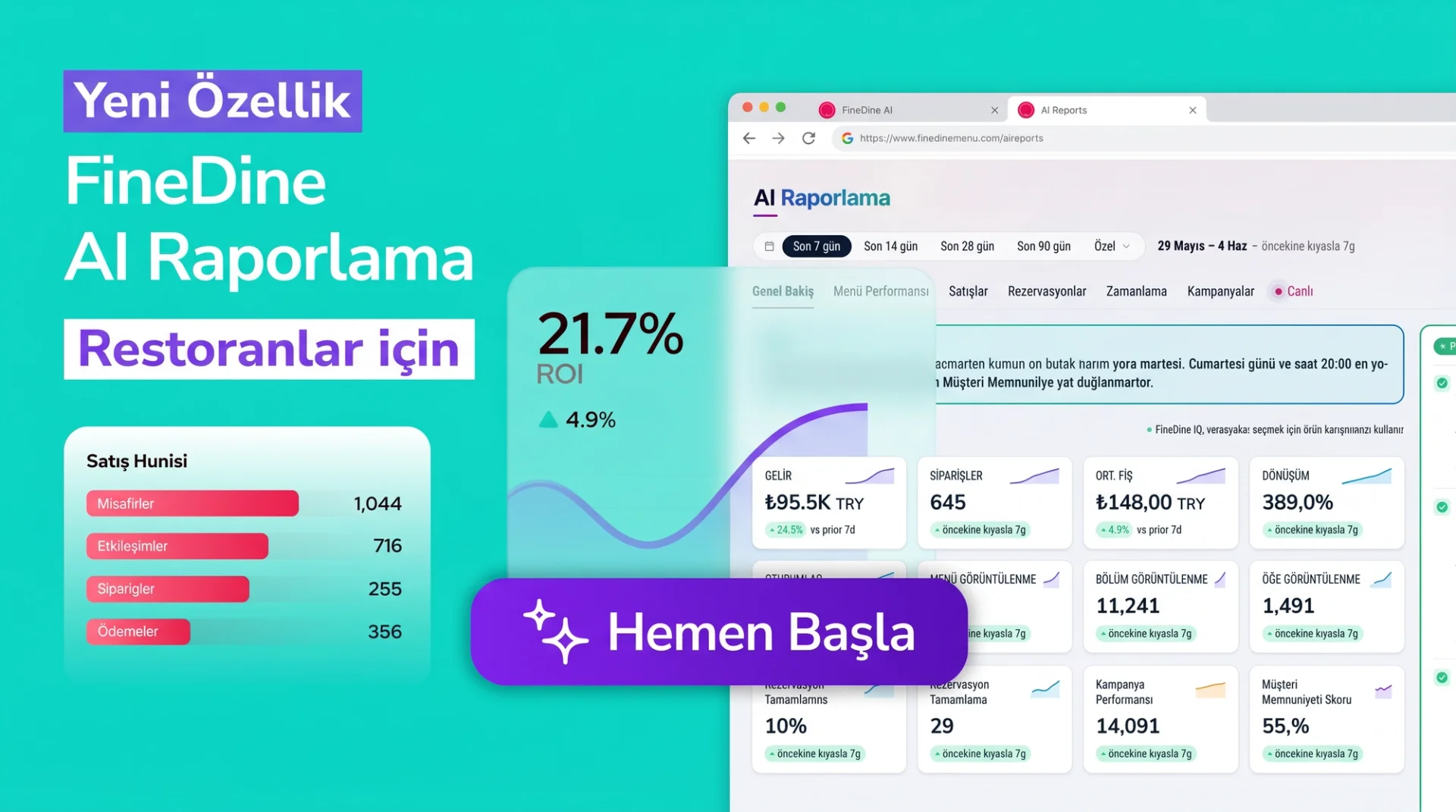
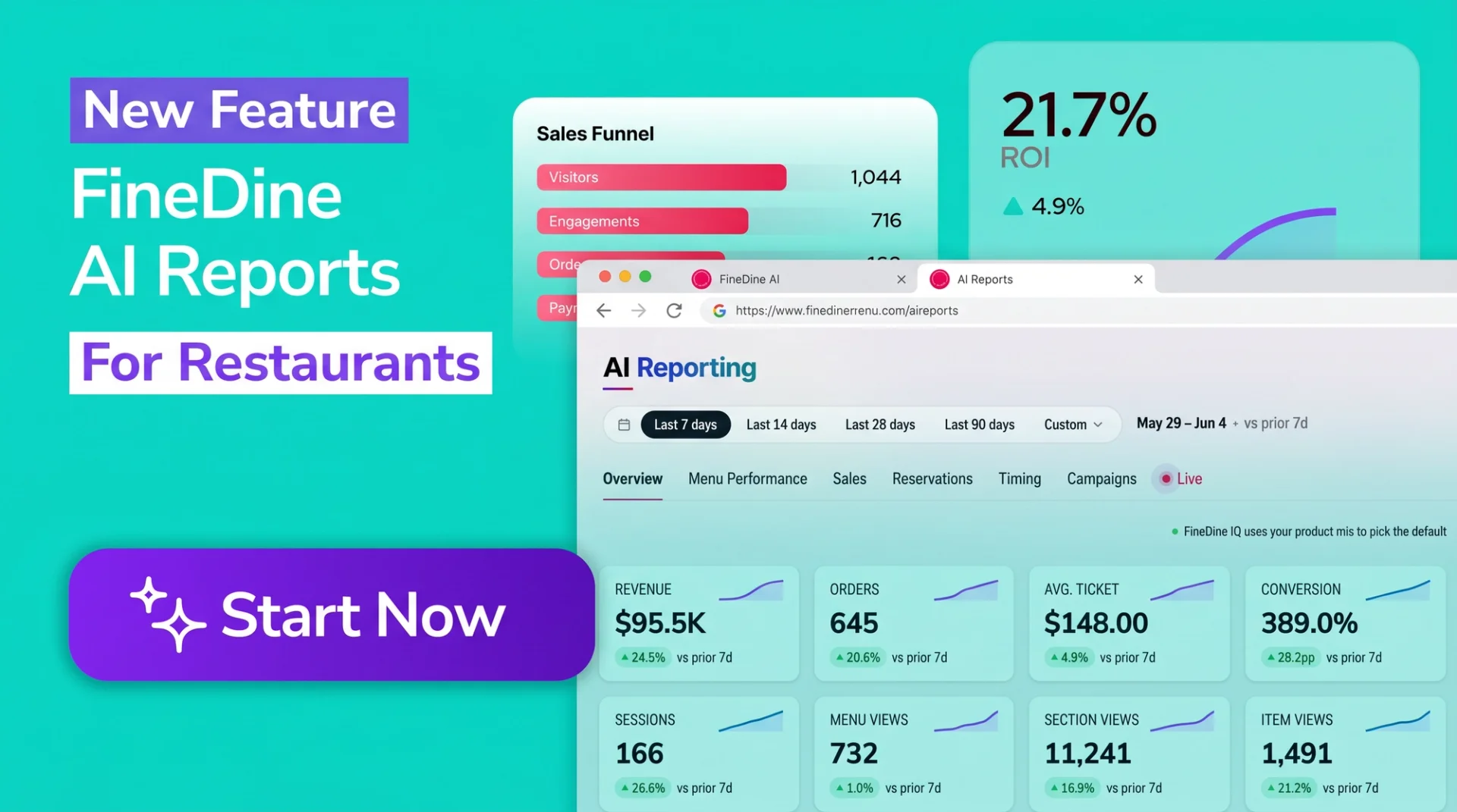
You no longer need an analyst, five separate tools, or a spreadsheet to read your own data. AI Reports is organized into seven tabs, each a different angle on the same shop: overall health, menu performance, sales, reservations, timing, campaigns, and a live feed. Every tab is per-shop, scoped to whatever you've selected in the shop switcher.
2. Track your whole restaurant across seven tabs.
Each tab answers a question you already ask yourself during a shift:
- Overview — How is the shop doing this period versus last?
- Menu Performance — Which sections and items earn attention versus revenue?
- Sales — How much money came in, and from which items?
- Reservations — Bookings, party sizes, no-shows, and table utilization.
- Timing — When during the day and week does activity peak?
- Campaigns — How are your in-app campaigns performing?
- Live — What are guests doing in your shop right now?
Menu Performance shows on every shop. Sales, Reservations, and Campaigns appear only where the matching feature — online ordering, reservations, or ads — is switched on.
3. Get your week summed up in a sentence or two.
At the top of the Overview tab sits a narrative banner that summarizes your week in a single sentence. FineDine AI writes it in your shop's language and refreshes it daily.
For example: "Revenue dipped 12% Tuesday — coffee orders are down." Or: "Revenue grew 8.6% to $36.0K on 1,273 orders — Sunday was your strongest day."
There's no chart to decode. When you open the dashboard in the morning, you get the read an analyst would spend hours producing, in one line. Want to go deeper? The metrics and charts that back the sentence are waiting on the same screen.
4. See your most important metrics at a glance.
The Overview KPI strip shows eight core metrics at once: revenue, orders, average ticket, conversion, sessions, menu views, section views, and item views. Each tile carries a 14-day sparkline and a delta badge against the prior period.
Below it, the trend chart plots revenue, orders, and sessions as daily lines — with a 7-day FineDine AI forecast tail overlaid. So you don't only see what happened; you see how the coming week is shaping up before it arrives.
Day-by-hour density heatmaps show which slots run busy, with darker cells for higher volume. A revenue composition donut surfaces your top six earners and their share of the total. You learn which item earns its place on the menu from a number, not a hunch.
5. Analyze menu and sales performance in one table.
The Menu Performance tab answers "where does the menu pay off?" It ranks categories by revenue share and by view share side by side, so a section that gets a lot of attention but few orders — or a quiet, high-converting winner — stands out immediately.
A conversion-versus-share quadrant places every item into one of four corners: top-right winners, bottom-right "sells well, low intent" (price-driven), and top-left "high intent, low share" (under-promoted). The item performance table lists the full menu with views, orders, conversion, and revenue.
Conversion has a precise definition here: the share of sessions that view an item and order it. Green is above 8%, amber 3–8%, red below 3%. Every large table carries search, conversion, and trend filters, and exports to Excel in one click.
6. See your restaurant live, as it happens.
The Live tab (currently Beta) shows your guests moving through the shop in real time. A red LIVE badge lights up while the connection is active.
The KPI row tracks active sessions in the last 60 seconds, events per minute, and orders in flight. A journey flow animates guests across six steps — QR → Menu → Section → Item → Cart → Order — with a colored packet for every new event. "What's getting attention" bubbles size your menus, sections, and items by recent activity, and a Time-on-item chart ranks the seven dishes guests linger on longest.
Because it's in Beta, the Live tab doesn't yet show figures like order amount or party size in the stream — those live in full on the historical tabs.
7. Let FineDine AI catch what you'd miss.
In the right column of the Overview tab, a FineDine AI rail surfaces two cards: Anomalies and Actions.
The Anomalies card automatically flags revenue dips, conversion drops, and channel imbalances — so problems surface while you can still act on them. The Actions card brings forward items missing photos, hidden bestsellers, and slow-day promo opportunities. Each one is a single tap to acknowledge, dismiss, or apply.
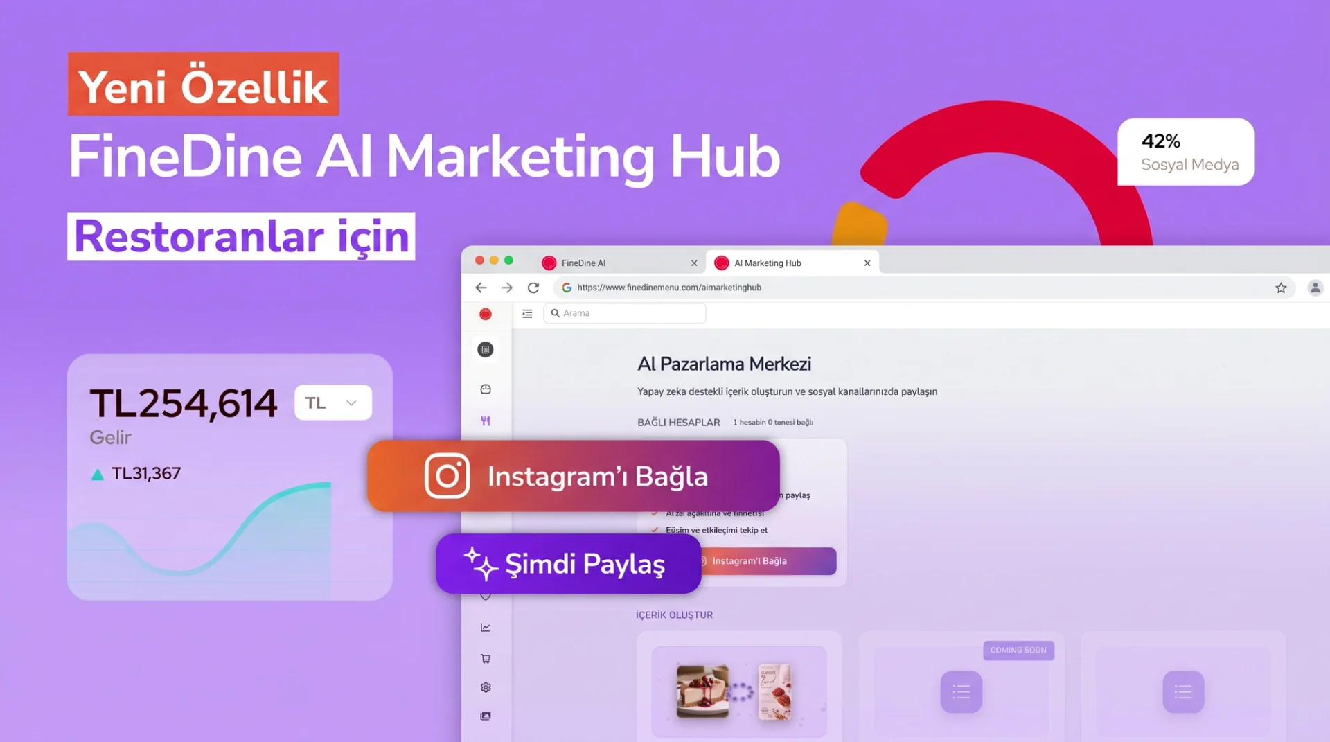
Every static label in AI Reports is translated into five panel languages: English, Turkish, German, Arabic, and Brazilian Portuguese. Every money figure uses your shop's own currency symbol — EUR, TRY, GBP, or any other — not a hardcoded dollar sign.
8. Start using AI Reports today.
You'll find AI Reports in the dashboard sidebar under AI Reports, carrying a small NEW badge until the feature is generally available across all plans. A date range picker lets you switch between the Last 7 / 14 / 28 / 90 days or a custom range and redraw the report on demand.
Your restaurant's data is already yours — what was missing was a single screen that made it readable. If you bounce between separate tools to understand your sales, menu, and guest behavior, or never open the reports at all, FineDine AI Reports turns all of it into plain language and puts it in front of you every morning.